Furniture Color Mistakes to Avoid: Common Decorating Errors
Choosing the right furniture colors is just as important as picking quality furniture. The wrong color choices can make a space feel unbalanced, overwhelming, or even dull. To help you avoid these common pitfalls, we’ve compiled a list of furniture color mistakes that can throw off your home’s aesthetic—and how to fix them.
What’s Inside
- Ignoring the Room’s Natural Light
- Sticking to One Color Too Much
- Ignoring the Undertones
- Overlooking the Room’s Overall Palette
- Following Trends Blindly
- Choosing Too Many Bold Colors
- Not Considering the Furniture’s Finish
- Clashing Wood Tones
- Forgetting About Maintenance
- Ignoring Personal Style
1. Ignoring the Room’s Natural Light
Natural light affects how colors appear throughout the day. A shade that looks rich and warm in the showroom might seem washed out or too dark in your living space.
How to Avoid It
Before committing to a furniture color, test fabric swatches or sample pieces in different lighting conditions. South-facing rooms get plenty of warm sunlight, which enhances warm hues like reds and yellows. North-facing rooms, however, receive cooler light, making blues and greens appear crisper.
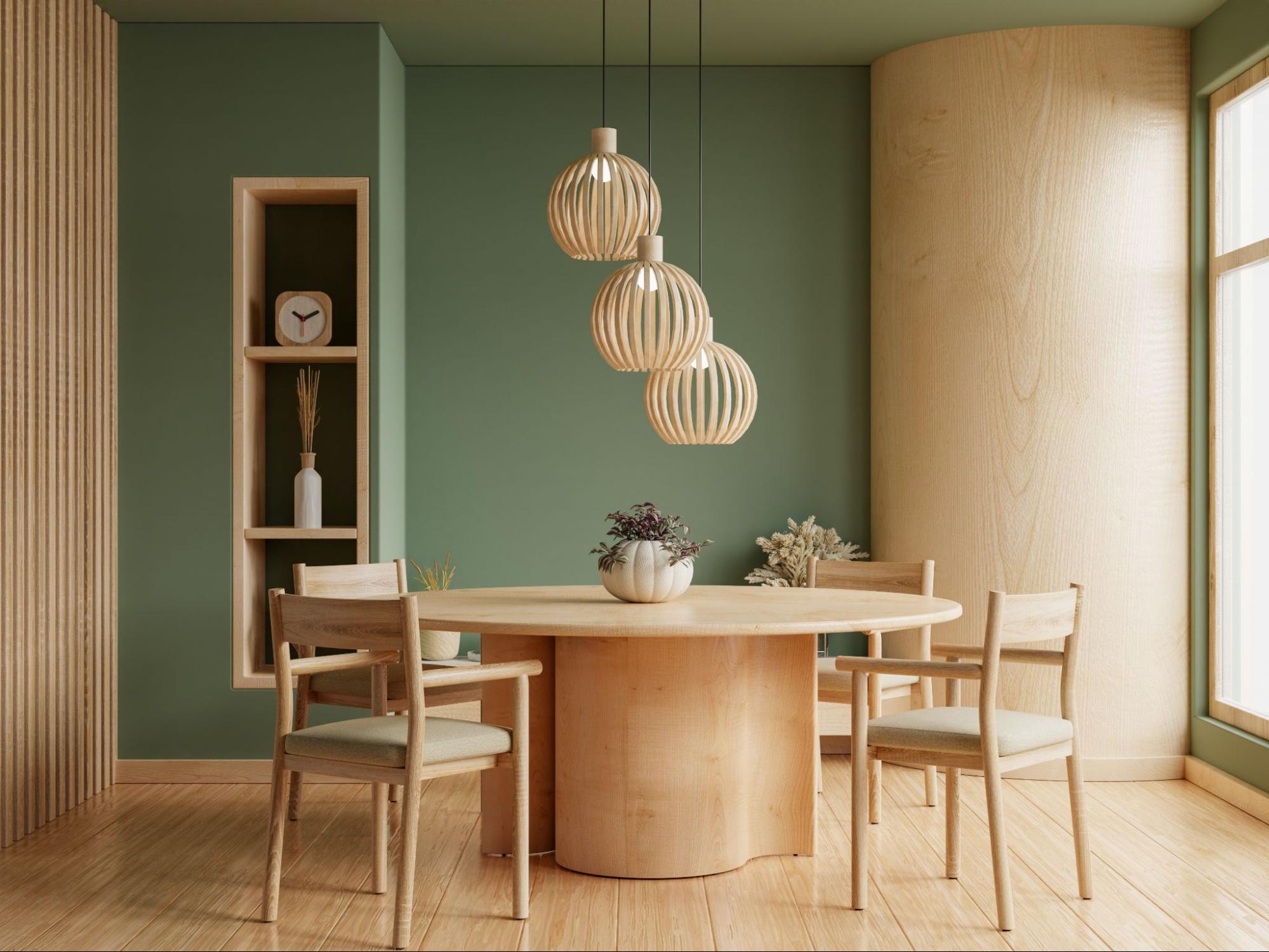
2. Sticking to One Color Too Much
A room filled with furniture in a single color can feel monotonous and lack visual interest. Too much of the same shade can make a space appear flat and uninspired.
How to Avoid It
Create contrast by mixing different tones and materials. If you have a neutral-colored sofa, consider pairing it with accent chairs in a complementary or contrasting shade. Adding texture through wood, metal, or fabric variations also enhances depth.
3. Ignoring the Undertones
Colors have undertones—warm, cool, or neutral—that can clash when mixed incorrectly. A gray couch with cool blue undertones might look out of place next to a warm beige rug.
How to Avoid It
Identify the undertones of your furniture before making a purchase. Compare pieces under natural and artificial lighting to ensure they harmonize well. Warm tones like beige, rust, or gold pair well together, while cool tones like blue and green complement each other.
4. Overlooking the Room’s Overall Palette
If your furniture doesn’t align with the room’s existing color scheme, it can create a chaotic or unbalanced look. A random color selection can make the space feel disjointed.
How to Avoid It
Stick to a well-defined color palette. Choose three to five complementary colors for the room, ensuring furniture fits within that scheme. If you love bold colors, use them strategically on accent pieces like chairs or side tables rather than large furniture items.
5. Following Trends Blindly
Trendy colors come and go, and investing in a bold, fashionable hue may leave your furniture looking outdated within a few years.
How to Avoid It
Instead of basing major furniture choices on trends, opt for timeless, neutral colors for large pieces like sofas and beds. Add trendy colors through accessories like cushions, rugs, or wall art, which are easier and more affordable to replace.
6. Choosing Too Many Bold Colors
A room with too many vibrant colors can feel overwhelming and chaotic, making it hard to create a cohesive look.
How to Avoid It
Use bold colors sparingly. Follow the 60-30-10 design rule: 60% of the room should be a dominant color (usually a neutral shade), 30% a secondary color, and 10% an accent color. This keeps the space visually balanced while still allowing for personality.
7. Not Considering the Furniture’s Finish
Furniture color isn’t just about fabric or paint—it’s also about the finish. A high-gloss finish can feel sleek and modern, while a matte finish may lend a more subdued, rustic vibe.
How to Avoid It
Think about how the finish of a piece interacts with the rest of the room. Glossy surfaces work well in contemporary spaces, while distressed or matte finishes suit traditional and farmhouse styles.
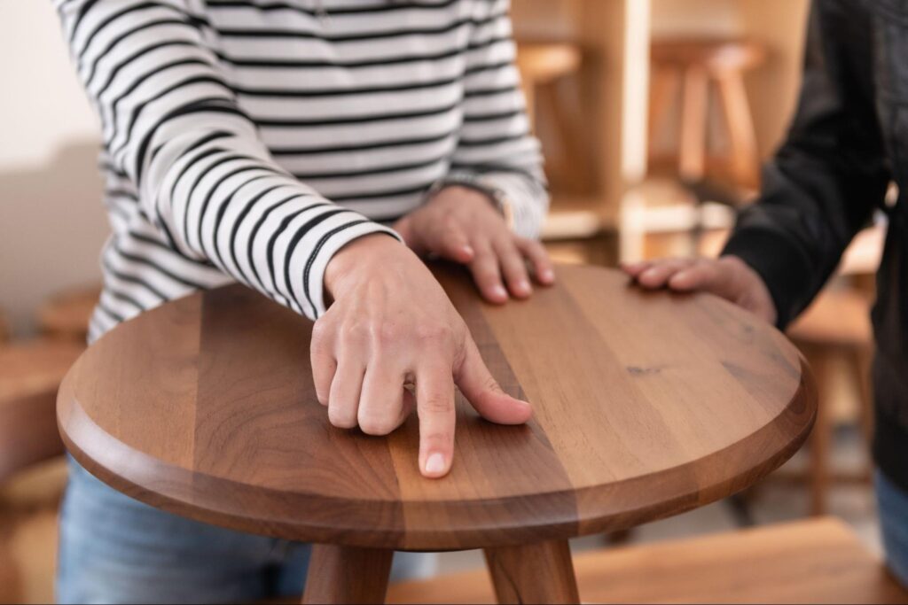
8. Clashing Wood Tones
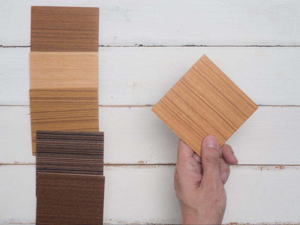
Mixing too many different wood tones can make a room feel disorganized. Some shades may have yellow, red, or ashy undertones that don’t work well together.
How to Avoid It
If you’re mixing wood tones, aim for balance. Stick to two or three complementary wood shades and use a common element—like similar grain patterns or finishes—to create harmony.
9. Forgetting About Maintenance
Light-colored furniture shows stains easily, while dark colors highlight dust and pet hair. If you don’t consider upkeep, your furniture may start looking worn out quickly.
How to Avoid It
Choose colors that match your lifestyle. If you have kids or pets, opt for mid-tone hues like gray, taupe, or patterned fabrics that hide stains and wear better over time.
Related: Dark vs. Light Furniture: Which Works Best for Your Style?
10. Ignoring Personal Style
Trying to follow all the “rules” without considering your own taste can make your home feel impersonal.
How to Avoid It
While these guidelines help create a visually pleasing space, your home should reflect your personality. If you love a particular color, find ways to incorporate it in a way that still works harmoniously within your décor.
Selecting the right furniture colors is key to a well-balanced and inviting space. Avoiding these common mistakes ensures your home looks cohesive, stylish, and functional. \
Looking for affordable home furniture in the Philippines? Visit our page—we have a variety of furniture items for you to choose from!
Like our Facebook page and follow us on our Instagram to keep in touch with us regularly.